React Portal and Tooltip
Full-Stack Developer with expertise in Angular, React, .NET, Node.js, Azure, and Docker, specializing in scalable applications, microservices, and performance optimization. Experienced in real-time collaboration tools, API development, and data-driven enhancements.
React is a great UI library that utilizes component-based architecture. In simple words, a React app is built using components that represent specific screens or elements in the app. These components follow the single responsibility principle and are rendered independently when their respective state and prop change.
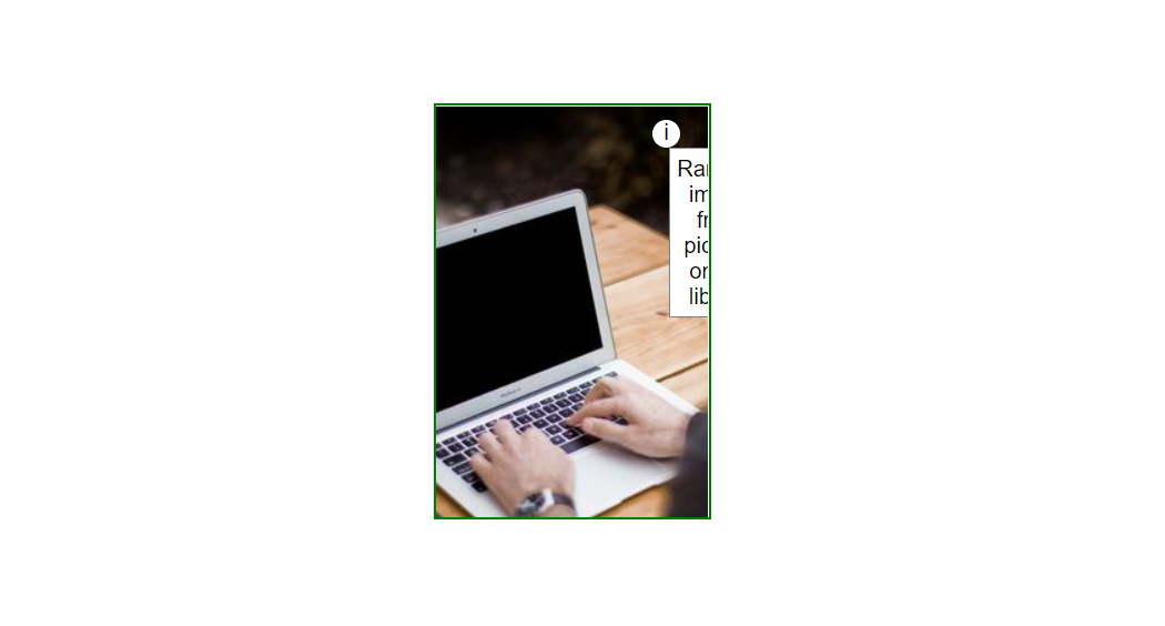
This component approach provides many benefits and eases the overall development process. However, since the components are discrete and only responsible for their own logic, it creates problems if we want to render a child component (such as pop-up, modal, tooltip, etc.) that may arise from a component with an overflow hidden style and/or takes up more window space than its parent.
Here is an example where the tooltip is hindered because of overflow:hidden of the parent element.
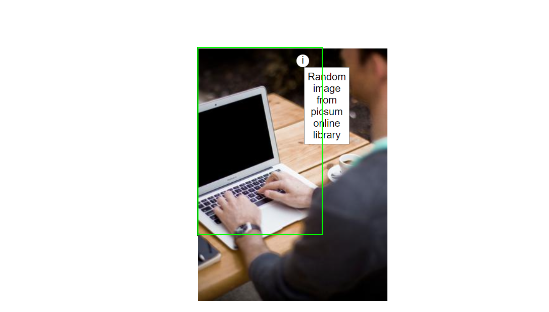
Without overflow:hidden, the image is coming out of the card component.
To resolve this behavior React has a special feature React portal.
React portals
React Portal is a first-class method for rendering child components into DOM nodes outside of the parent DOM hierarchy defined by the component tree hierarchy. The Portal's most common use cases are when child components (such as tooltips, modals, dialogue boxes, etc.) need to visually break out of the parent container without breaking the component logic.
Despite the fact that a Portal is rendered outside of the parent DOM element, it behaves similarly to a regular React component within the application. It has access to props and the context API. This is because the Portal resides within the React Tree hierarchy.
Tooltip
To create a tooltip component, append the tooltip directly to the document's body outside of the React mount root. Thus we need a portal and the exact coordinates for the tooltip.
Step 1: Add a new mount root for portal
<html>
    <body>
        <div id="root"></div>
        <div id="portal-root"></div>
    </body>
</html>
In this code snippet, our main mount root element is with id "root", the new mount root with id="portal-root" is where all of the tooltips/dropdowns should be mounted using React Portal.
Step 2: Create a reusable Portal component using createPortal in React
import { useEffect } from "react";
import { createPortal } from "react-dom";

function Portal({ children }) {
  const portal = document.getElementById("portal-root");
  const el = document.createElement("div");

  useEffect(() => {
    portal.appendChild(el);
    return () => portal.removeChild(el);
  }, [el, portal]);

  return createPortal(children, el);
}

export { Portal };
The primary function of this wrapper component is to generate a Portal for any React children passed into a component. Here the createPortal() is appending the child element inside the DOM element with id = "portal-root".
We are using useEffect React Hook to mount the element at the correct time and clean up on component unmount.
Step 3: Tooltip component
import { useState } from "react";
import { Portal } from "./Portal";

function Tooltip({ title, children }) {
  const [coords, setCoords] = useState({ left: 0, top: 0 });
  const [showTooltip, setShowTooltip] = useState(false);

  const mouseEnter = (e) => {
    const rect = e.target.getBoundingClientRect();
    setCoords({
      left: rect.left + rect.width / 2,
      top: rect.top + rect.height
    });
    setShowTooltip(true);
  };

  const mouseLeave = () => {
    setShowTooltip(false);
  };

  return (
    <div
      className="tooltip-wrapper"
      onMouseEnter={mouseEnter}
      onMouseLeave={mouseLeave}
    >
      {children}
      {showTooltip && (
        <Portal>
          <div
            style={{ left: coords.left, top: coords.top }}
            className="tooltip"
          >
            {title}
          </div>
        </Portal>
      )}
    </div>
  );
}

export default Tooltip;
In this code, the tooltip-wrapper has an onMouseEnter event handler that takes its current onscreen coordinates from an e.target object using the standard getBoundingClientRect() method of a DOM element.
Thenafter, we are setting the coords state for the tooltip and showTooltip is to toggle the tooltip is visible or not.
The onMouseLeave event handler set showTooltip to false, to remove the tooltip.
Note: We are not adding any style to the tooltip wrapper; additionally, children are kept visible, and the tooltip is located within the portal. As a result, the children have the exact coordinates of the tooltip-wrapper.
Step 4: Finally add Tooltip component to your App
import "./styles.css";
import React from "react";
import Tooltip from "./Tooltip";

export default function App() {
  return (
    <div className="App">
      <div className="card">
        <img src="https://picsum.photos/id/1/300/400" alt="bg-img"></img>
        <Tooltip title="Random image from picsum online library">
          <button className="info">i</button>
        </Tooltip>
      </div>
    </div>
  );
}
Things to consider when using Portals
Here are some of the non-obvious behaviors to keep in mind when using React Portals.
- Event Bubbling will work as usual — Event bubbling will work as expected by propagating events to the React tree ancestors, regardless of the Portal node location in the DOM.
- React has control over Portal nodes and their lifecycle — React maintains control over the lifecycle of child elements when rendering them via Portals.
- Portals only affect the DOM structure — Portals have no effect on the React components tree and only affect the HTML DOM structure.
- Predefine HTML mount point — When using Portals, you need to define an HTML DOM element as the Portal component’s mount point.
Conclusion
In this article, we discussed a common use case for React Portal and developed the tooltip component from the ground up.
The complexity of Portal tooltip is greater than that of a pure CSS/HTML solution, and it is up to the developer to select the appropriate approach for their respective component/project.